Talk Film Summer Camp: Lighting - Suspiria (1977)
Hey, campers! Glad you could join us for this inaugural Talk Film Summer Camp, where we here at Talk Film Society take a film per day, and dive into what makes each one a great example of one aspect of filmmaking. What we’re hoping to do here is spark a deeper appreciation for film and filmmaking in readers who may want to know more about each facet, so they can approach cinema with a deeper understanding of the invisible work casts and crews put in to tell a story.
Today’s topic is lighting, and the film we’ll be referencing is Dario Argento’s '70s dark fairy tale, Suspiria.
First, let’s break down some aspects of lighting in general. Most obviously, lighting in a film is meant to show you what happens. Without lighting, you’ve got a radio play. Less obviously, lighting also sets expectations and establishes atmosphere and mood in an audience—for instance, when a scene is lit with blue light, it tends to set an expectation for darkness or cold surroundings. When lit with orange or reddish light, warmer environs are the expectation. Crews achieve this lighting with use of gels, plastic sheets placed in front of or taped around the lights used in a scene. Other gel colors, like purple or green, can be used to create otherworldly or sickly effects, respectively (think the Matrix scenes from the Matrix movies—everything is green, and feels “off,” all because of the lighting, largely).
The use of gels is key to a film like Argento’s Suspiria, because Argento establishes the boundaries of where “safe” society is for his characters, and upends it by slowly injecting these safe spaces with off-putting splashes of color. He lights the safe, inviting spaces brightly, with low lighting contrast (that’s light-to-shadow—low contrast means a shot has little shadow in it compared to the light) and mostly white light. It results in a shot or scene that feels normal, calming, and inviting.
In an early scene, Argento shows us such a setting, in an apartment to which a girl from the dance academy flees in terror. The girl calms herself down, amidst safe, white light. But, on a shot that pulls back from the building, we see the room she is in is white-lit within the frame of the film, surrounded by encroaching purples and greens. There's an unsettling mixture of unnatural light, closing in on her. Expectations are set like a banquet table here. The terrified girl screams and breaks down, while the audience and her roommate both question why (although subconsciously, the audience knows to expect something amiss from the use of color).
Argento shows us just how much this girl doesn’t manage to reveal with a lamp she puts up to the window. She, and we along with her, see a pair of eyes staring back through this several-floors-above-ground window, and we're taken aback. She screams, and is pulled outward to be killed graphically, and slowly, in front of our eyes while her roommate cries for help that won’t come.
The final shots in this sequence are fast, saturated in colors, both in the scene and from gels on the high-contrast lighting. And how fitting for this article, that the scene should end on a shot of the roommate, on a white floor, impaled by fallen stained glass.
Argento plays like this quite often through the film, but no better than when our heroine’s friend Sara is first tailing, and then being pursued by, the dark forces within the dance academy. The white light of the “safe” dormitory rooms is long gone, replaced by an eerie crimson red in a common sleeping area. Sara, unsettled and nervous, is surrounded by reds and splashes of green light, which clash in the background and subconsciously disturb the viewer. Argento’s setting his table again.
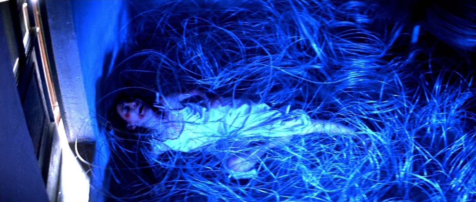
Sara is pursued into an attic, awash in deep, blue light, letting the viewer in on the fact that it’s dark, unwelcoming, and full of shadows from high contrast between key (light that focuses on the subject) and fill (light that illuminates the scene around the subject). As her pursuer closes in, fiddling with the door to the attic, Sara sees her possible escape through a high window into the next room, swimming with the “safe” white light of a dormitory.
She clambers to it, on rickety storage boxes, peeking through the window to see relative safety in an open door, on the other side of that next room, lit in comparatively warm yellow light. She pushes through the window blindly, lit herself in purples and deep blues. Argento even traces a line for our eyes between Sara and freedom, using the line of yellow light falling through the glass of the opposite door. As she jumps for it, the yellow of the doorframe is shown just out of her reach. She’s falls to her death into a roughly managed pile of razor wire, cutting herself to death as she struggles against the cold, blue steel.
The final sequences of Suspiria go all-in on the otherworldly color usage to establish just how out of her element Suzy Bannion is for the sake of answers. Try watching the film on your own (it's currently on Amazon Prime), now, and note when and where Argento places his gels in a scene, and where they meet or clash in the frame, and where Argento boxes out frames within the frame to focus our eyes. Then note what you’re feeling when you see these shots—a large part of it is due to the lighting.


