The Best Movie Posters of 2018
2018 was a great and diverse year for movies, and, in turn, a great year for movie posters. From experiments in minimalism to fun throwbacks to completely unique foreign market posters, it’s been quite an interesting year in the world of movie marketing. So contributors Marcus Irving and Harrison Brockwell put their heads together and selected the best posters the year had to offer.
Ant-Man and the Wasp
Blank space has rarely been used so effectively that it becomes the entire premise of the joke. The two titular characters are barely noticeable blips even though they’re dead center of the frame. Very funny and very creative, perfect for the most comedy-forward spin-off series in the MCU.
- Marcus
Ballad of Buster Scruggs
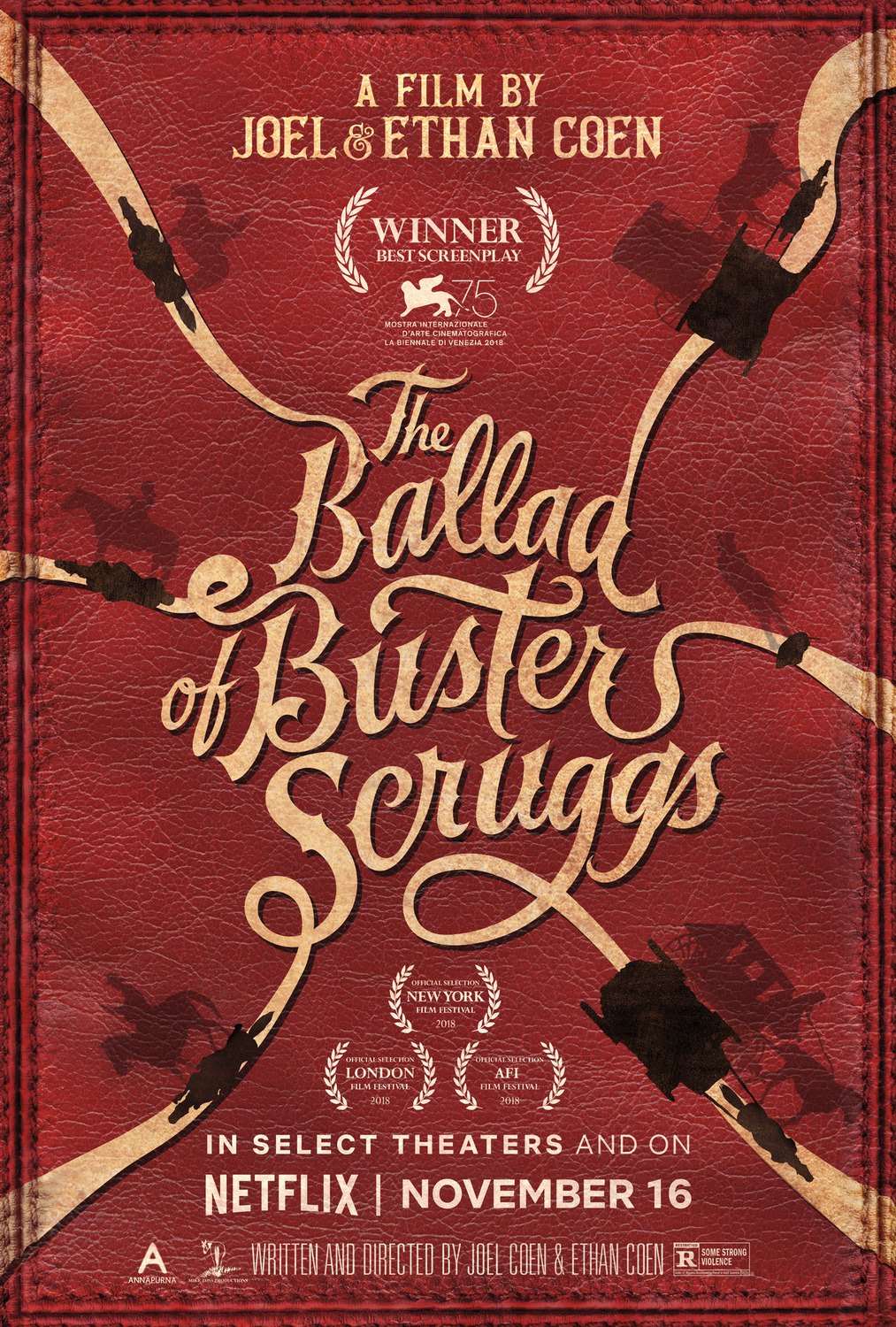
Six paths divulge from the same point, a perfect representation of the Coen Brothers’ Netflix Original. On each path sits a silhouette of a character from the film, a good easter egg for those who have seen it. The two variants each bring something to the table. One, a simple desert scape, has an extra biting tagline, and the other a pretty red leather finish and a warmer color palette.
- Marcus
BlacKKKlansman
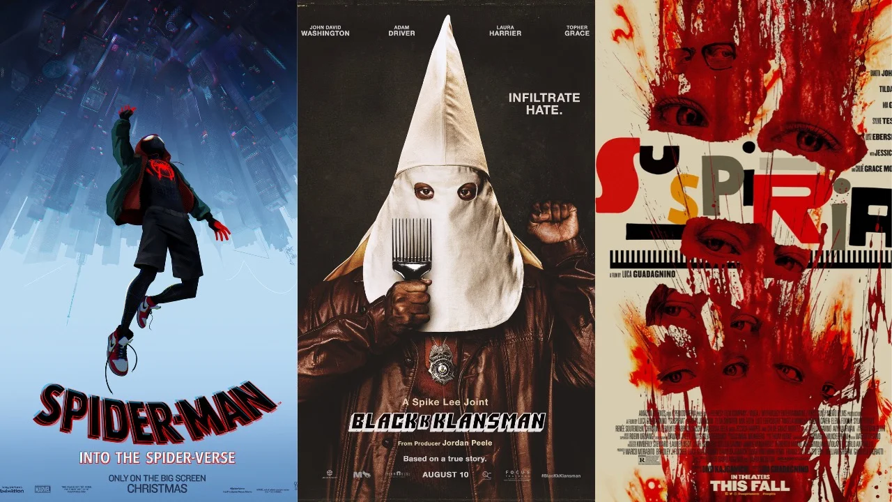
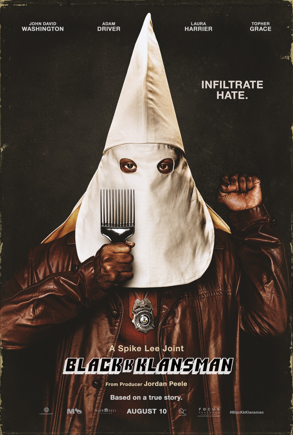
The poster for Spike Lee’s latest hits like a punch in the face. The image of a Klan hood is always arresting, but to see it on the head of an African American male is very upsetting. Matched with the tagline “infiltrate hate,” this poster is an incredible mission statement and pitch for the whole movie. Everything you need to know is there. The afro pick, the black power fist, the universal symbol of hate that is the hood, and the police badge make it crystal clear not just what this film is about, but the candor with which Lee is going to address it.
- Harrison
Game Night
As an avowed David Fincher fan, this might be my favorite poster of the year, due to the connections between this and the Criterion Collection cover of The Game. They’re essentially the same film, except Game Night treats the whole premise as the insanity that it is. The house being placed at the center of a maze is perfect as every plot thread starts in Bateman and McAdams’ house and radiates out. The silhouettes falling off the maze are both an homage to The Game and symbolic of the characters falling into actual criminal activity. This poster owns.
- Harrison
The First Purge
Speaking of overtly political posters, this one for The First Purge is as outright targeted as it is simplistic. The choice to link the dystopian nightmare that is The Purge to the “Make America Great Again” hats speaks to the political fear and unrest that underlies the later movies in the Purge franchise. Not only that, but the only other text on the poster is the release date, July 4th, directly targeting the American identity and nationalistic fervor surrounding Independence Day. It’s an immensely confident poster that makes it very clear the creators’ perspectives on the current state of the world.
- Harrison
Halloween
My personal favorite poster of the year comes from the South Korean release of the 2018 Halloween reboot. Michael Myers’ iconic knife is shown stabbing something unseen, but whatever it is it’s bleeding. A lot. Copious critical praise cleverly flies out like blood. Its rare that a promotional image can actually scare, but that’s just what this does. It’s just as brutal as the film it’s based on.
- Marcus
Overlord
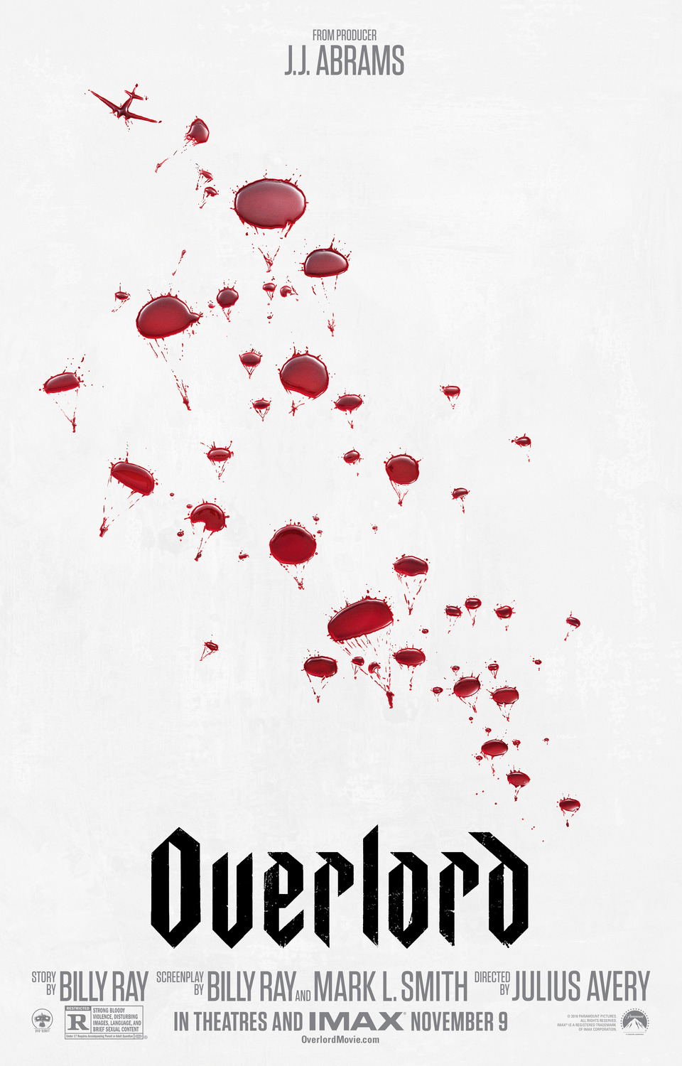
This is a masterclass of minimalistic poster design. Blood splatters on a white background that double as paratroopers jumping out of an airplane serves Overlord perfectly. As a movie about killing Nazi zombies in World War II, this poster quickly and efficiently gets the viewer ready for what the film has to offer. It’s about World War II, and is going to be violent and bloody. The poster only highlights those aspects, because that’s all it needs to do.
- Harrison
The Predator


These Chinese posters are just insane. If I tried to extrapolate anything about The Predator from these, I would imagine the collective insanity of that film would break my brain. These four posters depict the Predator, in full armor, break dancing, dunking a basketball while wearing a jersey that says “Alien”, skateboarding, and (my personal favorite) playing video games on a computer that also says “Alien”, which I assume is a play on “Alienware.” I for one, love the image of the Predator as a rad 90s gamer dude, eternally living in the Teen Zone. What does this tell me about the film? Nothing. Do I care? Not at all. I want these hanging in my home.
- Harrison
A Simple Favor


Similarly to The Spy Who Dumped Me (below), this female-led thriller also had a ton of great posters to choose from. The regular set features perfectly chosen colors paired with great photos of the leads, while the rarer set features homages to great whodunnits of the past.
- Marcus
Skate Kitchen
This one-sheet for Crystal Moselle’s narrative feature debut is just right. A bunch of skateboarders hanging out near a giant banana which acts as halfpipe, the city skyline just visible beyond. It’s fun and funny, and the well chosen color palette is the icing on the cake.
- Marcus
Sorry to Bother You
The first part of this poster that gets your attention is the colors and the font work. The font, mixed with the bright purples and reds, creates a surrealist tone but also convey a sense of humor, which ties into the satirical and slightly off-kilter feeling that permeates Sorry to Bother You. But these colors all clash, standing out against each other in a way that is profoundly uncomfortable and off-putting, underscoring the conflicts that thread through the whole film and every character. In addition, Lakeith Stanfield standing at the center, beat up, disheveled, but still on the phone, gestures to Boots Riley’s depiction of the personal suffering required to succeed in a capitalist system, and that one must work through that suffering without comment. It’s a great encapsulation of the themes presented in Sorry to Bother You, while also just being gorgeous and striking in and of itself.
- Harrison
Spider-Man: Into the Spider-Verse
A running theme throughout Spider-Man: Into the Spider-Verse is having to take a leap of faith to know if you are ready for something. This poster not only captures Miles Morales mid-leap, but also impresses how out of his comfort zone he is for most of the movie’s run time. Depending how you look at it, Miles is either falling, unprepared for the situation he finds himself in, or he has leaped down towards the city, making the decision to protect it. It’s also just a gorgeously rendered poster.
- Harrison
The Spy Who Dumped Me


I may not have liked the film very much, but I can’t deny that The Spy Who Dumped Me spent its budget well. On screen, the action scenes easily rival the best of recent spy films, and offscreen, the marketing department clearly had a blast creating a large group of jaw-dropping posters. Each one is wholly unique and as stunning as the last.
- Marcus
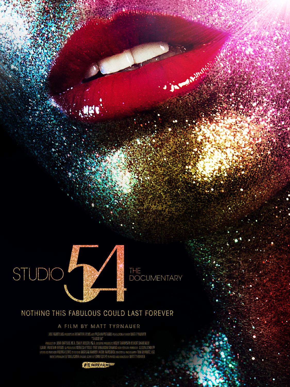
Studio 54
The Manhattan nightclub Studio 54 was known for over-the-top glamour and sex, and that’s exactly what you get with this poster advertising the recent documentary made about the infamous club. A beautiful close-up of a voluptuous face covered in colorful glitter with a shade of a darker side shown on the back. Despite being so simple, the image perfectly conveys the excess that the club was known for for over fifty years.
- Marcus
Suspiria
This poster is uncomfortably gross and chaotic. The lack of a unified font and order for the film’s title, the mess of colors spread across the whole poster, the way the blood splatters smear at the edges; this poster hums with a discordant energy the likes of which I have not seen before. However, there remains a sense of order to the chaos, most likely rooted in the eyes in the blood, which convey a sinister intent, as if the poster itself is watching you, the viewer. This poster is intentional, orchestrated chaos. And I love every inch of it.
- Harrison
Tully
Charlize Theron is known for fully throwing herself into her roles, and in just this poster you can see every bit of the exhaustion on her face from playing Tully, an overwhelmed mother of three. Her face is adorned in stickers that are worn like battle scars, and she wears a look of shock, as to suggest her kids have done something else crazy. Cringey tagline aside, this is a funny poster.
- Marcus

